


I’ve noticed that two things make me happy in terms of nail polish color: glitters and bright colors! Alas, glitters are not really work-friendly unless your job requires wearing a feathered head gear. But bright colors I still can do for the everyday. In moderation.
 So you can be sure that I’m really happy with this season’s trend of bright pastels. Not neon, just delicious, vivid, cheerful colors. O.P.I., Orly, Essie and even Chanel indulge us in yummy, bright Easter-egg colors!
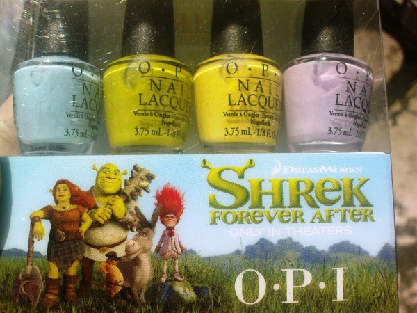
O.P.I. comes to the market with the Shrek Forever After Collection, coincided with the release of the 3rd Shrek movie (or is it the fourth? I can never keep track of numbered editions). The colors are cheekily named, but suffice to say there is a green (da!), yellow, two blues (a darker blue and a pastel blue), two purples (a dark grape purple and a soft pastel lilac). I’ve go the mini set, which does not include the darker colors. The pastel yellow is particularly cute and wearable I think. It’s slightly tinged with green but I think still neutral and can fit any skin tone, a cute choice for the toes. The crowning jewel in this collection, however, is the green. No other word for it, it’s Shrek Green; it’s the next best thing to having a skin tone like Shrek’s. I love it!
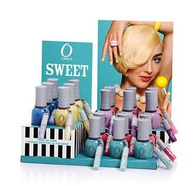
Orly follows the trend with its Sweet collection. I have not seen this set in person, but from the swatches, Cotton Candy, the pastel peach color, is a knockout. And if you don’t already have …two, three, seven (!) pastel blues and greens, consider getting the ones in this set, Snowcone (the blue) and Gumdrop (the green). They’re rumored to have great application and shine. And did you know that Orly bottles are much larger than most polish in the market? Yes, a whopping 0.6oz compare to 0.5oz. Check out the swatches for this set here.
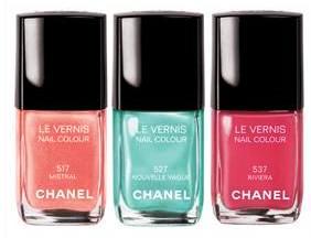
Chanel. Oh Chanel. If it weren’t for your prices, I’d be getting Nouvelle Vague before you could say gorgeous grayed-green jade! Nouevelle Vague is exactly that, and is part of Chanels 2010 Les Pop-up de Chanel. It’s not without its dupes, but alas, there is no Chanel like a Chanel. Ahem. So if their recent bag-price increases get you down, here’s something (more) affordable that will guarantee a smile every time. At $23 a bottle, it’s a bargain, come to think.
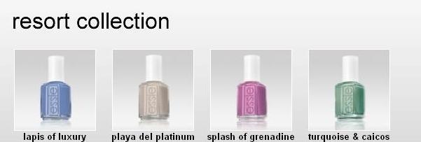
And last we come to my favorite release of the summer 2010: Essie Resort Collection.
Sometimes, upon seeing gorgeous bottles of paint, drool trickle involuntarily from the side of my mouth. And this was it. It’s a set of just four and they’re all very pretty and wearable. Rarely does that happen, as I am very finicky about my polish, and just one meh color will put me off a whole mini set (otherwise an affordable way to hoard).
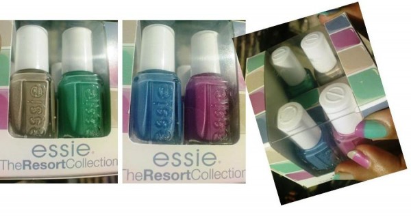
Turquoise and Caicos (the green) is McDreamy in a bottle. Lapis of Luxury (the blue) is the King of Pastel Blues. Splash of Grenadine is a cute magenta pink that I know I’ll wear lotsa times ’cause it’s just so spunky (like Hani’s new haircut). And Playa del Platinum, well just saying the name out loud is already an orgasmic delight (you know, the way Salma Hayek would say it…go ahead, try it!).
Not knowing which color to use first, of course I did what was rational. Use them all!
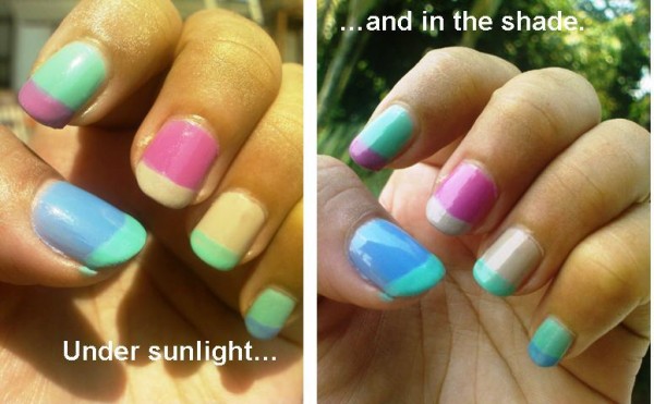
Note however, there seems to be a bit of controversy about the actual color of Turquoise and Caicos, with some people getting a more grayed-green version. This kind of confusion happens all the time with Essie; it’s strange how they seem to have a tendency to change their mind mid-production. Although, now that I have the bright version, I would also like to have the grayed version. Hmmm… maybe it’s a marketing trick to get people to buy multiple bottles of the same color. Doh!
Well, this was so much fun to write. Tell me, are you riding the bright pastels bandwagon? I don’t really follow the Japanese or Korean brands, are their new releases following this trend?
*Pictures are my own and from Chanel.com and OrlyBeauty.com
