


Some seasons tend to have colours that are specific to that season. Spring and Summer usually feature a lot of vibrant colours, whereas on Fall and Winter, you see a lot of hues that are muted, dark and soft.
With the economic situation not yet fully recovered and all our investment plan laid out, we tend to hesitate to purchase something that will only last for one season or even less. You want to buy something that will last you this season and can be carried over for the next and beyond. So when you’re splurging on something, you don’t have to feel guilty about the purchase at all.
Spring and Summer this year bring you hues such as coral, tomato red, turquoise, violet and blue. Whereas the more neutral and soft shade, such as soft grey, blush pink, muted beige and lastly white, that you currently see a lot will be carried over to Fall and Winter. Confused on what to get to fill up your wardrobe? Here’s a few hints for you.

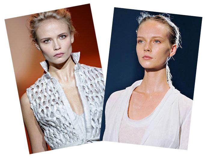
How do the colours above translated into makeup colour palette? As for the neutral, as can be seen on the runway of Carolina Herrera and Calvin Klein, that nude makeup is coming into a more glossier and light reflecting approach. The key is to ensure that your lips are fresh and free of colours (or giving the illusion that you’re not wearing any). This will bring out the best feature on your face. We’re loving MAC Eyeshadow in Copperplate for a little bit of muted beige on the eyes or the Bobbi Brown Eyeshadow in Bone just to even out your eyelid colours and give that ‘nude’ look on the eyes.
As for the vibrant shades you will see it everywhere on the face. Like tomato red, coral and violet on the lips (our pick is MAC Lady Danger and Violetta lipstick), daring orange, dark blue and green on the eyes, as well as different shades of blush, from the barely-there natural flush of light peach and pink to a more daring one. But we’ll stick to our favourite MAC Dollymix blush to create both effects.
The nails, well the colours has been translated into to-die-for vivid pastels with creme finishes. We actually can’t pick favourite here. But, maybe we can get the mini size of Essie The Resort Collection, so you wouldn’t have to decide which colours to get!
Fashion-wise, my favourite is got to be the tomato red (or coral if you want something more subtle), violet and amparo blue. Of course that is not forgetting, that there’s no wrong in investing another crisp write shirt or dress. Also, if you’re looking for military-inspired pieces, try to break away from the khaki, cream and army green shade and find a colour that you would like, like for instance the double breasted jacket below in blue.

Among all the colours, if I can only choose one colour to get now, I would choose something red. When I have a lemming to buy something, for instance a tomato-red lipstick, I would have a complete mental picture on my head on how I would wear it. This time, it’s me wearing my crisp white shirt, bare face look sporting the new lipstick, stepping off from my new stylish Mazda2 (in red of course!). Well of course, on that picture I can actually drive on my own (I know one of these days I have to start to learn how to drive). Maybe getting the Mazda2 will be big enough motivation for me to learn, so the car and I can zoom-zoom our way through the city 🙂

*Pictures are the courtesy of www.style.com, ASOS, Cotton Ink, Urban Outfitters

